Thursday, April 21, 2011

Mohawk Community Builders [the outcome]

Hey all!

I'm back with some final pieces that came out of the brainstorming from the last post… I've a logo and a poster to share. The logo stayed the same, I was very happy with the font choice and thought that it gave the logo an approachable appeal to everyone.


The poster was an idea that came to me recently about Hamilton being recognized as "The Hammer" and how it is also a tool in construction. The two needed to be represented together to make a poster with impact. This was the result:


It's always nice when work comes out looking 10 times better than you had envisioned for it…! Hope you enjoy it, Mohawk!

Wednesday, March 30, 2011

Mohawk Community Builders

We've got a high profile project working for Mohawk yet again.
This time it's for the Community Builders initiative. I'm kind of stuck where imagery and concept are concerned for the poster/flier. However, where the logo is concerned, I've got one idea that seems to stick out in my mind - now to… 'build' on this idea and go from there!


here's a very quick example of the poster concept I would like my project to take on. Two student builders high-5'ing, forming the shape of a rooftop with a child underneath - almost as if she's being housed by them.


Saturday, March 19, 2011

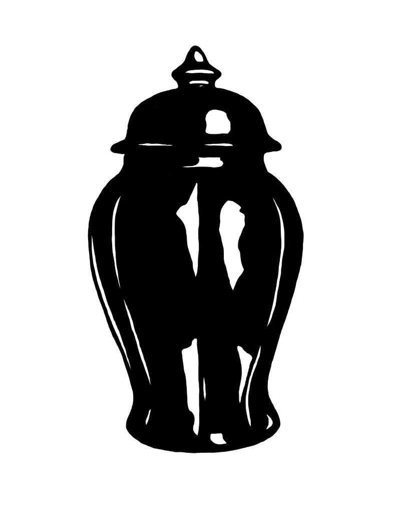
…how to stir loom.

Or how to wake what you think is a genie but is really a big loomslick.

Watch out, now.


Talk about being rubbed the wrong way.

Wednesday, March 16, 2011

…pseudo street art

This is what happens when you want to do the sort of thing guerilla street artists do, like BANKSY or Sheppard Fairey, but fear getting arrested.
…Or just would rather sleep at night than painting within the shadows.


My imagination takes some pretty cutesy-strange shapes, I'd say.


Sunday, March 13, 2011

swarm warnings

Good evening, guys and ghouls.

Playing a wee bit of catch up tonight on some Illustration Friday activities.

The name of the game(s) is Swarm. The next, being Warning.
Both intriguing, yes? Of course.

Swarm begged a lot of insect imagery. Loads of scary fuzzy bees, or ants, or creepy crawlies I was in no way fond of. Butterflies, however? Lovely. And while that was still predictable on my part - I felt having one, the opposite of the term "swarm" would be compelling enough for a great composition.
I decided to capture the one that signalled the inevitable swarm to follow.

Out of my tummy, that is.


The next was kind of a no-brainer (for me, anyway). Warning is a word that is, of course, associated visually with a lot of household product warnings, or even traffic signs.

What's funny to joke about, but could also use a friendly warning?

A woman's curves, no doubt.

Dangerous curves, anyone?


It is what it is, and to be honest - I really dig Illustration Friday as a means of constant creation. On top of all the other assignments I've got sitting here glaring at me? Not so much.
But it's not something I see myself ending after I leave the world of academia. 

Enjoy, loves.

Sunday, March 6, 2011

Layers (and the layers within the layers)

Greetings all :)

A couple of weeks have passed, and I'm still chipping away at the creative cannon that is Illustration Friday.
One of the finished pieces I'd like to share today was created while working on the idea umbrella of the word "Layer".

I sat back for a day or two and watched to see the potential idea gamut that would roll in on the Flickr Pool.  There were a lot of cakes, a lot of cross sections, but, to my delight - no eccentric, esoteric pieces.

I'm talkin'bout auras, yall.

I won't get too deep on the concept (that's what Google is for, after all!) but an aura is an energy field (actually, roughly 7 according to my current research/reading)  that surrounds each one of us - we just can't see them. Energizing them can be done a number of ways, one of my favourites involves crystals and natural stones from the earth. Each auric layer is represented by a number of stones.

For this illustration, I picked the strongest stones and went to town.

First I started out with a couple of body samples and a shot of my head to kind of get a rough idea of how I wanted the body to be positioned. This took time, mainly due to my perfectionist attitude, and the need to ensure the proportions were right.
For the body, I consulted the book from which I've been retaining all this information: The Chakra Handbook.


The next steps were all about improvising. As you can see here, I wasn't necessarily following the models shape for shape, but more for an idea of positioning and proportion.


I leave the style up to my imagination and intuition (as all artists should).


Here the basic body is done. All that is left to illustrate are each of the 7 separate layers starting from the legs up to the head, and then the bubble this yogi intends to rest within.

To allude to the stones associated with each layer, I went digging for macro images of each stone to create a separate layer path (ha! see what I did there?) for each one.


The result, needless to say, is a colourful decal/sticker kind of effect - something I'd quite like to see on notebooks, art boxes or guitar cases. I love the vibrance of each layer and really enjoyed the response I received from it's initial posting. 

So there you have it! Stay tuned for more goodies, friends!


Wednesday, February 23, 2011

McNificently Terrible

McDonalds is an empire that has many a foe. Many of them tend to be the little guys - us. Over in VICELand, freelance writer Kyle G blared his anti-establishment horn while jumping up and down on his soapbox in an effort to single-handedly turn the McGiant on its head.

It wasn't successful - but he harps about his small (albeit pointless) victory over the working class league perched under the golden arches.

One of his genius ideas he tried so diligently to push forward: The McNificent. A triple-stacked burger of death yielding its quad-bypass-inducing meat combination of beef, fish and chicken.
The over-eater's sloppy, wet dream. And clearly, an image that I had a hard time trying to shake.

As a response to the editorial, I decided to create some illustrations that play along with the farce Kyle G decided to orchestrate.


Bada ba ba bah… as it were.

Monday, February 14, 2011

Illustration Double Whammy

It's been a productive week, everyone!
Illustratrion Friday has really got my creative juices flowing, with last week's word "Reverse" and this past Friday's choice, "sweater".

Here's my submission for "reverse":


Reverse

This also doubled as a commission piece for a friend and client of mine who moonlights as a freelance writer. His piece will be released later on today.


As for "sweater":

Sweater [Swagger Like Us]

People like to kid about my sweater collection, and I always tell them that my #1 inspiration is The Cosby.

Looks like he approves :)

Enjoy!

Sunday, February 6, 2011

Illustration not done on a Friday…

Hello hello!

Welp, this has been complete for about a week now, but I've just got around to posting it up here (a thousand apologies). Here's my submission for last week's Illustration Friday's word "Surrender"

Surrender

Like it? I was rather pleased with how it turned out - despite having a completely different vision for it. If you'd like to read more about what my initial plans for the illustration were, mosey on over here.

Peace & Love!

Monday, January 31, 2011

Vector Lovin'…

I love creating vectors, here's one that I intend on printing on t-shirts very soon.

Love Peace n' Hair Grease [b]

Love, Peace & Hair Grease, yall.

Illustration Friday, January 28th 2011

Here's my submission for last week's Illustration Friday topic, "dusty".


Dusty


Swept up and kept in a pretty jar.